How to create a great tips menu
Making a good tips menu for your SinParty account is going to help you increase your earnings potential. It’s a way of letting your fans and partygoers what you have available in terms of custom content – which is where the money’s at.
We’ve already gone through where to go create your tips menu, and given you some ideas of what should go one there, but how to make your menu stand out?
On design platforms, there are lots of templates that you can use to create a tips menu. They key to a great one is to use what’s available to you and customize the shit out of it. Not too much, though.
That’ll start to make sense once we get into it! We’re going to be looking at:
- What goes on the background of a good tips menu
- How to choose the font you use on your menu
- What to write on a great tips menu
- Handling emojis and stickers on your tips menu
Along with some general tips that are going to see your tips menu start popping and bringing in some serious dollar for you.
What do I use for the background of my tips menu?
The background of your tips menu is important because it sets out who you are and what you do. It tells the people looking at your profile the type of content that you create and the style you go for in your porn content.
Whilst having a plain color or a pre-made design from a place like Canva might be the easy route, easy doesn’t make money! Have a look through your content and find a image that speaks to you. It might be of you, your set up, or just your clothes, but it’s all you.
The main color of your image is going to dictate how the rest of your menu looks so choose a pic with a good shade. You can add colors and edit it in other ways with apps on your phone.
Which font should I use for my tips menu?
The most important thing to consider about your font choice is how readable it is. Remember, not all of your clients will be native English speakers so might struggle with complicated fonts that are too swirly, like this:


Other tips for choosing the font, or the style of writing are:
- Don’t use too many fonts – most designers will tell you that two or three fonts are plenty
- Make sure that you can see the colors against the background – if you’ve got back lingerie on then change your text color so that it pops
- Use a background on your text to make it stand out if you’ve got lots of colors going on in your main image, like you probably do on your Insta posts
How do I write my offers on my tips menu?
The way you write your tips menu will depend on the way you interact with your partygoers. For example, if you’re a dome you will write very differently to how a brat would.
Avoid too many words. Think about your experience with a restaurant menu – do you bother reading everything if it’s chock full of words and details?
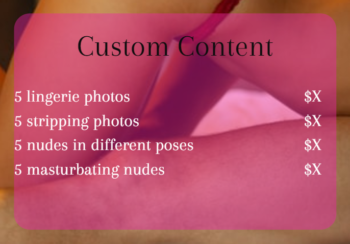
Keep your offers simple, like so:

This stops there being any complications with what your partygoer is paying for.
As a general rule, you’ll charge for some content by the minute, such as videos and voice notes. A good tips menu will have the starting price and how much per each extra minute. If you cater to fetish content, be sure that you price separately for this – fetishes and kinks attract higher prices!
It’s worth adding a note that makes it clear you’re open to discussion of other packages, if you are. Maybe you don’t have the girlfriend experience on your menu but you’d not turn down a decent offer – keeping yourself open to offers means you don’t miss out on lucrative stuff.
Can I use emojis and stickers on my tips menu?
If stickers and emojis work with your look and character you present to your partygoers, go for it. Gamers, creators who cater to Hentai fetishes, anyone who plays the brat or even the girl next door are all niches that lots of cool or cute emojis would work.
They can make your menu look a little messy. When you’re designing it, take a step back and make sure that the text doesn’t look overloaded; you want your words and any images to be the first thing people notice when they want to buy your content.
Be sure to cover up your nipples and vulva if you’re planning on sharing your menu. Here at SinParty, you can let it all hang out for the world to see. Post your beautiful boobs with nips standing proud on your Facebook and you won’t have a Facebook account for much longer!
What makes a good tips menu?
Your tips menu should be a reflection of you and the content you create. Pink hearts and cursive fonts when you make hardcore porn isn’t going to help you make your money.
You already know that creating content on SinParty is all about the visual – work that when you make your menu. Have a strong image of yourself and what you offer, but also make it so you can share it outside of SinParty.
Be sure to include your SinParty link on your menu so that people can find where your content’s at, too!


Leave A Reply